Art Made Easy : Understanding Value
A new series of Work Along Videos demystifying core Art Fundamentals

So many Art concepts are shrouded in jargon that makes them hard to decipher. I am going to guide you through these ideas in plain language - because it really isn’t as tricky as it seems… it’s all quite doable. The only caveat? You do have to practice these concepts in order to get better at them. But no worries - we’ll do this together!
I will be providing worksheets to go along with these videos. These are free for you to print and use! Just right click, hit save and print as many copies as you want. The Worksheets are listed at the end of the post.
The reference images we will be working from can be found here: REF IMAGES
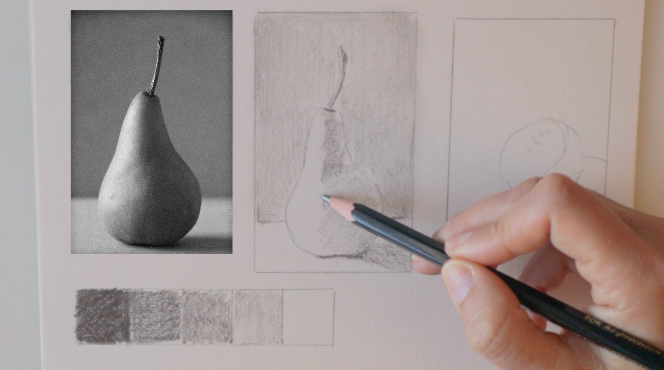
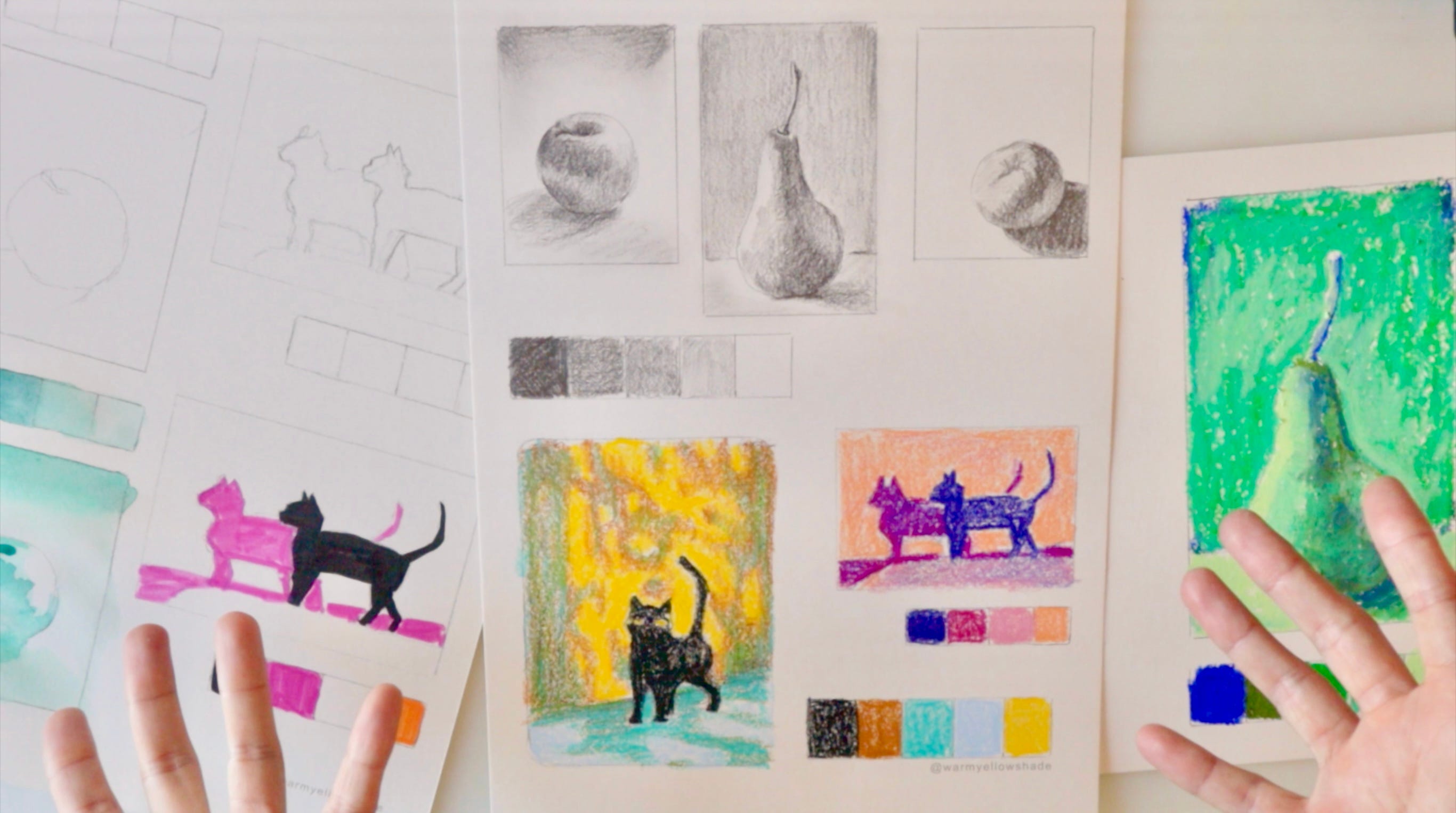
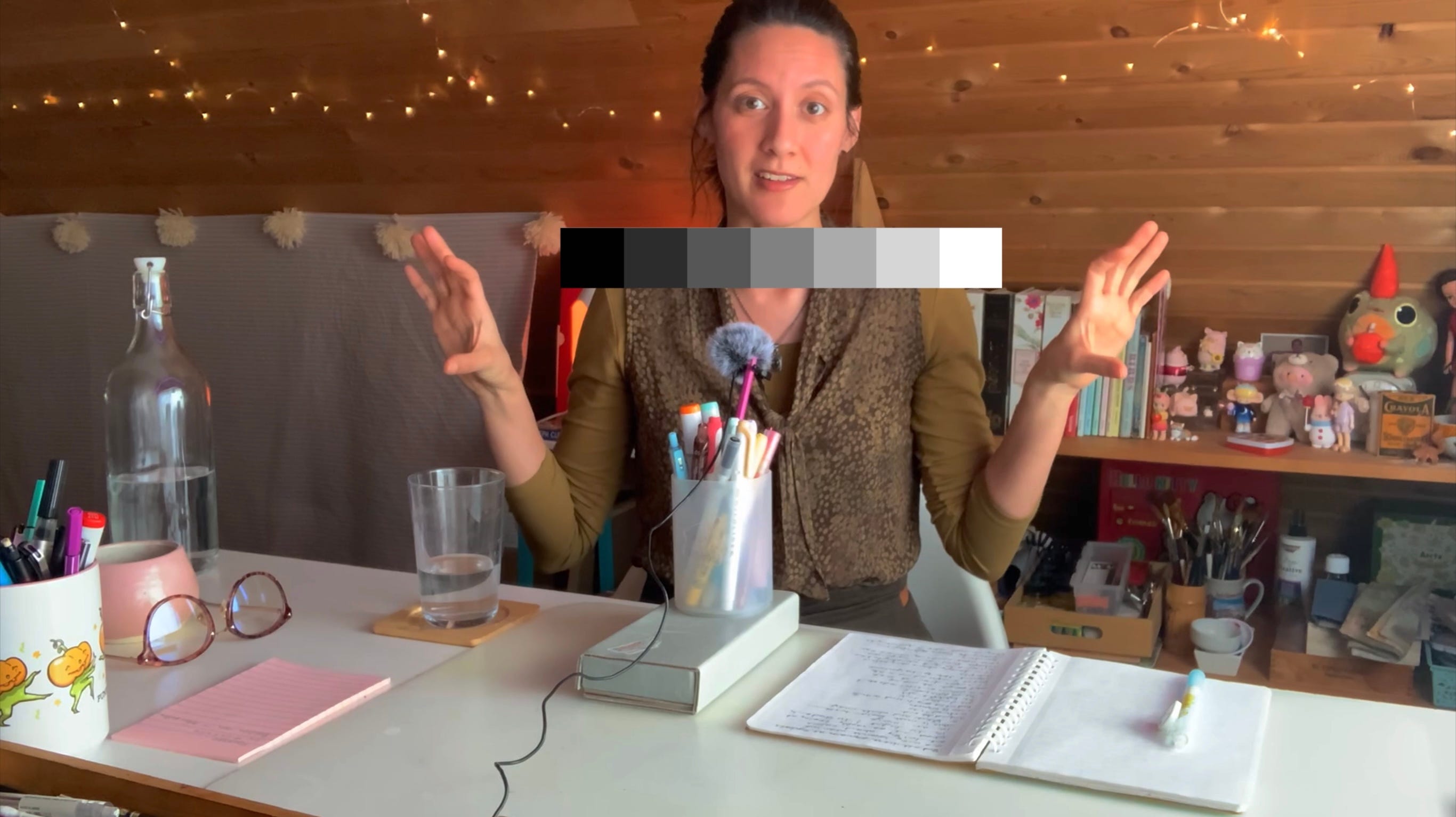
The first thing we need to understand when learning to study Value, is what it represents. Value is really a way to describe how light or dark an object or a scene is. It’s a way to talk about light and shadow in terms of a scale. A Value Scale. This is just a series of boxes. We are going to work with 5 boxes. As you get more experienced you can add more squares. For this exercise you will need a graphite pencil. I recommend something 2B and up. I will be using a 4B pencil. The softer the lead… The darker your darkest value can get.
The first step is to create your Value Scale - from the darkest dark to the lightest light. This will be your guide and a reference. This scale will both help you notice where certain values lie and act as a venue to practice making those values. All with your trusty graphite pencil!
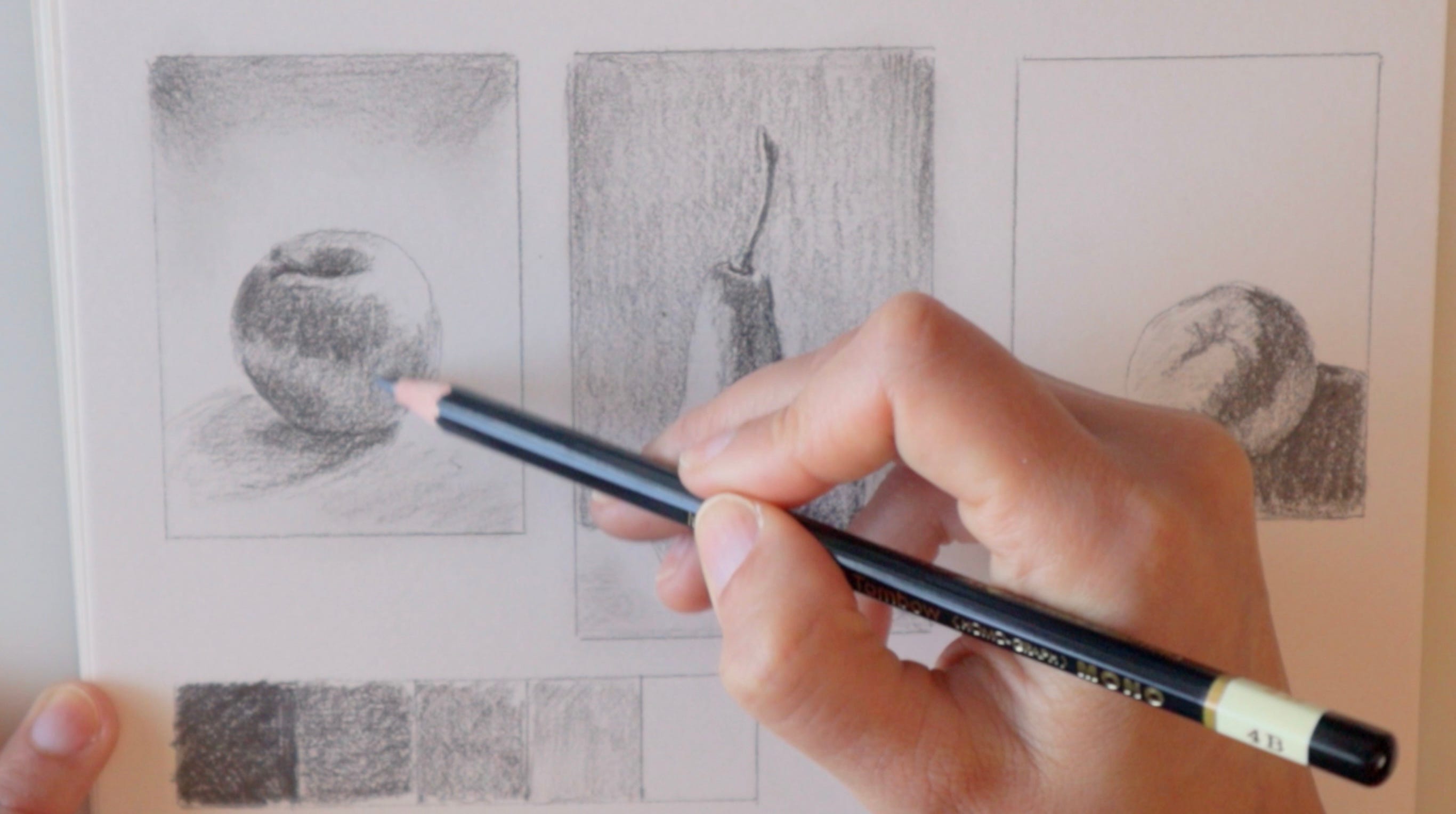
When working from reference it is always going to be easier to translate a black and white photograph into a black and white drawing. It is much more challenging to make the translation from color to grey scale. So if you are finding the color images too difficult, stick with practicing from black and white until you get more comfortable. This is not an easy thing to practice and it can be very tiring for experts and beginners alike. So do as much as you can. If this is all very new to you I would recommend maybe just one fruit per session. It takes time to learn to see Values. So the more you practice, the better you’ll get!
If you are having trouble seeing, try squinting. Squinting blurs the image and makes the borders between values more apparent, it’s a handy trick that painters use all the time! Build your Values up slowly. Try to avoid erasers. A sharpened pencil is more precise, so keep a sharpener handy!
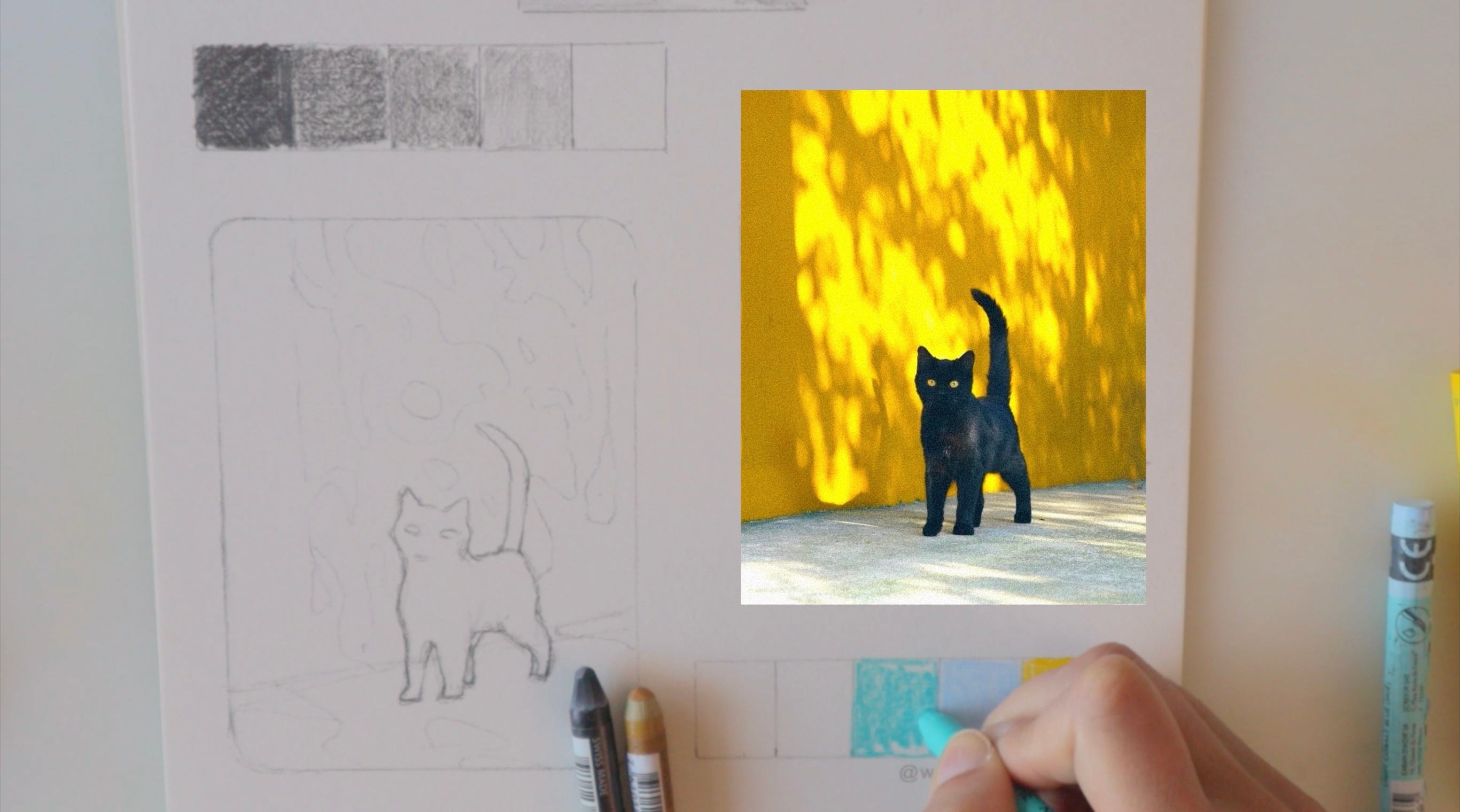
Adding Color makes life extra complicated! But life is in technicolor so we have to start practicing to see Color in terms of Values. Squinting is very helpful but another good trick is to take a photo on your phone, turn the saturation all the way down - and check your Values. We will tackle Color in the next video, but with this excercise we can start to explore the added challenges that come with hue. And start practicing to see and to notice! If adding color becomes too confusing just stick to the black and white exercises until you are more comfortable.
Please watch the YouTube Video associated with this post for more information.
Print out your worksheets and come join me for a walk through on How to use them!
Sometimes we have to work through the hard stuff to make improvements. But trust me, it’s so worth it! The more tools you have under your belt the more you can explore!
Have a great Art Practice.
-Debby


